Preston Guild, Gateway Preston
International Design Competition - Shortlisted (2009)
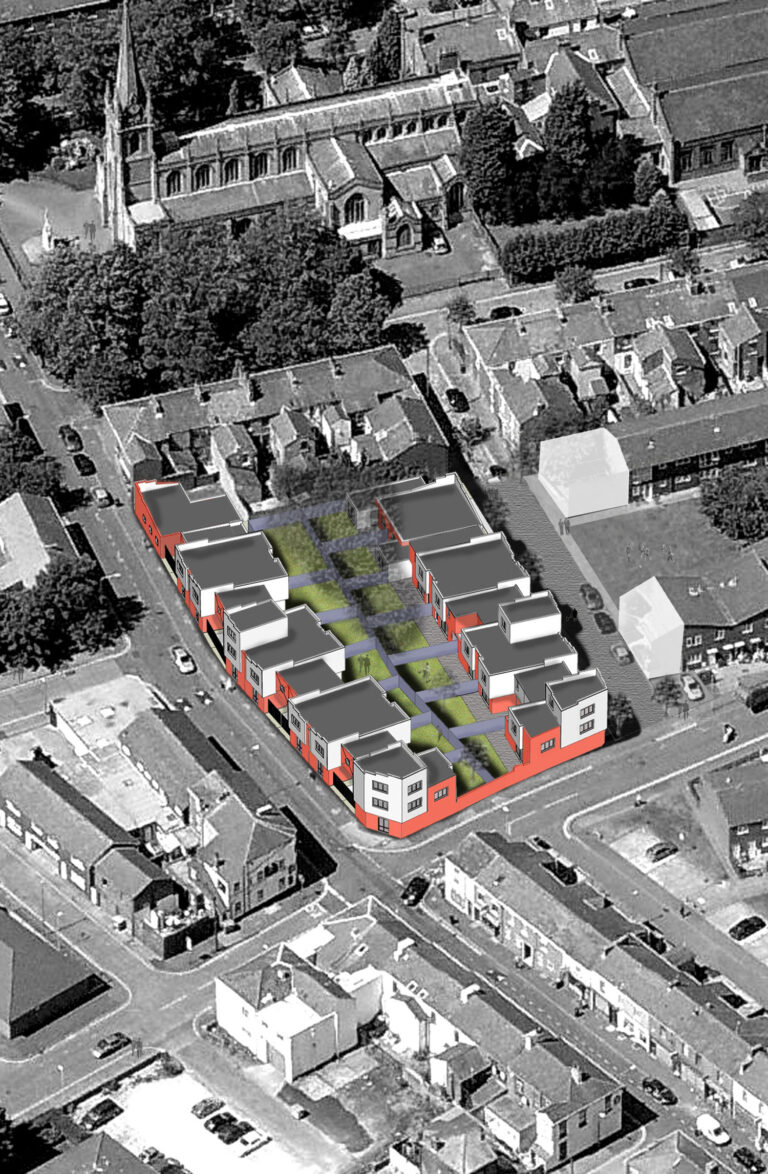
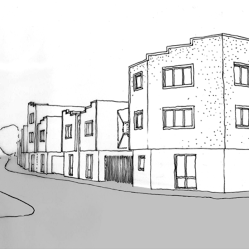
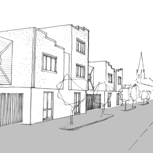
In our approach to the competition we tried to establish a balance between a design based on tested and formulaic requirements, and one that is innovative and creative. The proposal is modern but not unfamiliar. Being historical in its reference, the design appropriates the surrounding context. Brick decorative detailing from the Victorian terraced houses, red brick patterned ground floor, rendered external walls from the Meadow Street shops and commercial buildings, all contribute to make a modern building familiar.
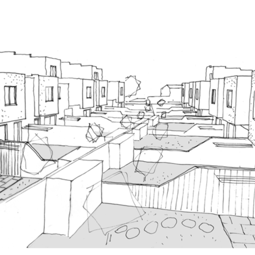
The mass and form of the building is broken into elements to emphasise individual dwellings within a larger complex of buildings. This also ensures the façade is animated and engaging by avoiding a monotonous building edge. Building heights vary, providing a hierarchy and interest along each building row.
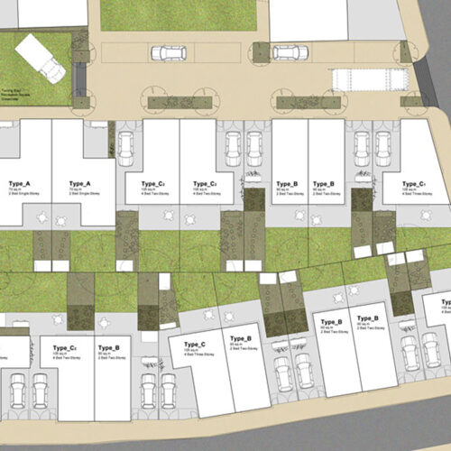
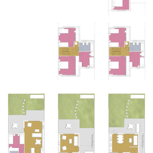
The dwelling layouts are based on a repetitive module set out around an initial grid. The module is varied according to the dwelling size and type. The base module, although not apparent, always prevails.
